|
EXAMPLE
OF A CULMINATING PROJECT
In this section
you will find an example of a Culminating Project put together by
two future teachers as they worked through the MDM4U course content
for the first time. The Culminating Project is a major component of
the MDM4U course. Students can find personal interest in the subject
they take up in their project and they can do a very good job if they
start the project early in the course and return to it at various
times. It is my recommendation that students identify an area of interest
early in the term and that they be required to have found appropriate
data within the first two weeks of classes. Additional data can be
identified as the course develops. When a major section of the course
is concluded students should be asked to reflect and apply what they
have learned to advance their project. They will find that some sections
are directly applicable to their project and area of interest, while
other sections will only provide an opportunity to explore concepts
that marginally apply to their area of interest. A variety of activities
have been assembled in the area we have called Projects by Sections.
These are very much work in progress and some of the work did not
make the Culminating project. These are examples of the best that
the students could do at the time, however on further investigation
new ideas were generated or new data was found that fitted better
into the Culminating Project. For your benefit links are provided
in the Culminating Project to parts of the Projects by Sections that
did not make the Culminating Project. This final product is certainly
not perfect and one could argue with some of the statements and conclusions
made within the Culminating Project. Nevertheless we hope that you
will find this resource useful and that you will join the discussion
group of mathematics teachers of MDM4U. Best wishes with the course.
Eric Muller
CULMINATING PROJECT
Mathematics for Data Management
- MDM4U
By
Sherrie Dyck and Bruce Petrie
Why am I paying so much for my car insurance?
Section
1 - searching for an area of interest and locating data
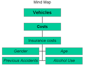
I started this project by exploring various areas
of possible interest. These were universities, employment and vehicle
costs especially that of car insurance. Although my initial areas
of interest were quite varied. (For a diagram of my brainstorming
click
here)
I found that I had to limit my search for information to something
that was more manageable. My search for data soon led me to concentrate
on the issue of car insurance.
The first question that I raised was whether car insurance rates
were affected by alcohol use. Although one company discounted the
cost for abstaining from alcohol I did not notice any substantial
difference so I dropped this avenue but for interest I sought out
data on alcohol related accidents and found the internet source
http://www.nh-dwi.com/caip-206.htm
from the Community Alcohol Information Program (CAIP), a private,
non-profit agency founded in 1977 to provide alcohol education, assessment,
and evaluation services to persons convicted of alcohol related offenses
in New Hampshire. These statistics are complied by the U. S. Dept.
of Transportation and the N. H. Department of Safety. Since I found
no data on Canada, I did not pursue it further. I did not follow up
any further on the issue of alcohol and driving.
I decided to search for data on car insurance costs and found that
quotes could be obtained from
www.kanetix.com
which allowed me to compare costs for different insurance companies.
Once the questionnaire was filled out, the only variable that I changed
was age so that I could get a fair comparison without changing other
variables. As I suspect the insurance costs varied with age and gender.
So I decided to follow this up by looking for information on Canadian
age and gender data from ESTAT available from Statistics Canada.
The data that was collected from ESTAT was accessed in the following
way:
1. Go to
http://estat.statcan.ca/ and choose ENGLISH.
2. Accept the terms of the preceding Licence Agreement.
3. From the Table of Contents choose Eduction, Data,
and Students.
4. Search for the following table numbers to locate the information
regarding the possible research topics.
110-0002
110-0029
I also searched for data which would give me information on accident
rates and age of the driver. I did find some data on the Fathom CD
itself which I obtained as follows:
1. Choose Open from the File menu.
2. Open the Sample Documents folder, then the Learning Guide
Starters,
and then Accidents.
For information on what the document should look like, click here.
Although this was a start I did not have any information on Ontario.
It is only much later into the project that I located data that I
would have liked to have had from the beginning! In the Ontario Ministry
of Transport web site
http://www.mto.gov.on.ca/english/
I did a search on "driver licenses by age", from which I found a
number of Ontario Road Safety Reports and I selected one of the more
recent ones for the year 2000 under the heading "Ontario Road Safety
Annual Report 2000 - PDF", with web address
http://www.mto.gov.on.ca:80/english/safety/orsar/orsar00/ors_00.pdf
With these various sets of data I was ready to start narrowing down
my questions and exploring what the data I had found could point to.
Section
2 - Applying various mathematical techniques in the analysis and exploration
of the data
Section
2a - Analyzing data involving one variable
Problem
There were serious limitations concerning the Fathom data itself.
I preferred the Ministry of Transportation data because it was Canadian
and compares accidents to age and the age distribution of drivers.
Although I did quite a bit of analysis with the Fathom data, it was
only after I located the MTO data website
http://www.mto.gov.on.ca/english,
and its Ontario Road Safety Annual Report 2000 that I made substantial
progress.
With this data, exploration will take place concerning drivers involved
in collisions and drivers killed with both put into perspective concerning
the amount of drivers licensed per age group. This should allow me
to draw useful conclusions concerning the distribution of insurance
rates.
Plan
To gather data from the MTO website, access the internet address
http://www.mto.gov.on.ca/english/ and press "search".
Search the MTO for the "Ontario Road Safety Annual Report 2000".
Access or download the full report, not chapters, in .pdf format.
The .pdf file can be found at the internet address
http://www.mto.gov.on.ca/english/safety/orsar/orsar00/ors_00.pdf
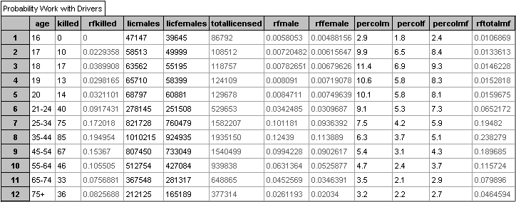
.The data to be used is found on table 2.2 "Category of Person
Killed by Age Groups 2000" and table 2.20 "Driver Age Groups
- Number Licensed, Collision Involvement and Per Cent Involved in
Collisions 2000". I think the limitations of the data are insignificant,
e.g. unlicensed drivers are taken into consideration for "Drivers
Involved in Collisions" but not added to the "Driver's Licensed"
used to calculate the "% of Drivers of Each Age Involved in Collisions".
Data
The data obtained from the MTO is as follows as entered into Fathom
Collection Charts:
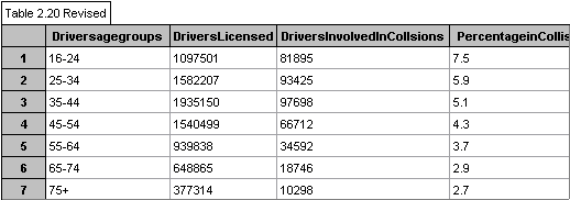
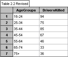
I have revised the charts to include
the age group 16-24 and the data has been restricted to include only
the data I want to explore.
In Fathom the following dot plots were made
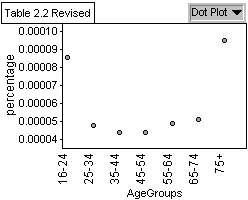
to graphically represent the data in table 2.2 and table 2.20:
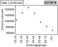
Graph 1: Population of Licensed Drivers by
Age Group
Graph 2: Population of Drivers
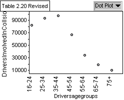
Involved in Collisions by Age Group
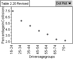
Graph 3: The percentage of Drivers
Involved in Collisions by Age Group
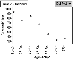
Graph 4: The amount of Drivers Killed
in an Accident by Age Group
Graph 5: The Percentage of Drivers Killed
(considering Drivers Licensed) in an Accident by Age Group
Analysis
Graph 1 shows a bell-shaped curve of licensed drivers by age group
with the most licensed drivers being in the 35-44 year old range.
Graph 2 shows that the age group involved in most collisions is the
35-44 year olds. Graph 3 shows a regression in values and that the
highest percentage of drivers involved in collisions when the amount
of licensed drivers is taken into consideration is the 16-24 year
olds. This reveals that even though there are more 35-44 year olds
involved in accidents than 16-24, it can be explained by the greater
amount of 35-44 year old licensed drivers. Graph 4 shows a regression
in deaths as age increases but when graph 5 is taken into consideration
there is not really a difference in the amount of deaths between age
groups.
Conclusion
The data represented in graph 3 reveals that
the percentage of drivers involved in a collision decreases as age
increases. However, our data does not take into account the amount
of driving done by age group or how often they are on the road. This
data could support a decrease in insurance rates as age increases
so in the next section I will explore insurance costs and further
explore the data in graph 3.
Section
2b - Analyzing data involving two variables
Problem
Now that I have seen that the percentage of drivers involved in a
collision decreases as age increases, tests should be done to see
if there is a linear relationship. That is, what is the equation of
the line of best fit? Then a correlation coefficient needs to be determined
to see how well the line fits. I will also compare what I find to
the data I retrieved from Kanetix concerning insurance costs.
Plan
To determine the line of best fit, y= a + bx, x and y must first be
defined. Then numerous calculations need to be done concerning the
sum of squares. Using the values calculated to determine the equation
of the line of best fit, a correlation coefficient will be determined.
Data was obtained from Kanetix by entering standard information that
remained constant. A different age was entered for each set of data.
Ages I entered were between 18 and 32 with 2-year intervals (i.e.
18, 20, 22, 24, ..., 32). This was done for both males and females.
The data obtained from Kanetix was entered into a collection chart
in Fathom. Fathom was also used to create a scatter plot to see the
relationship between the age of a driver and cost of insurance.
Data
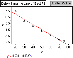
Let x be the midpoint for each of the age groups. Let y be the percentage
of
drivers involved in a collision.
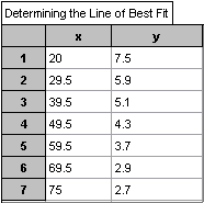
|
|
Analysis
The following calculations were made with Fathom:
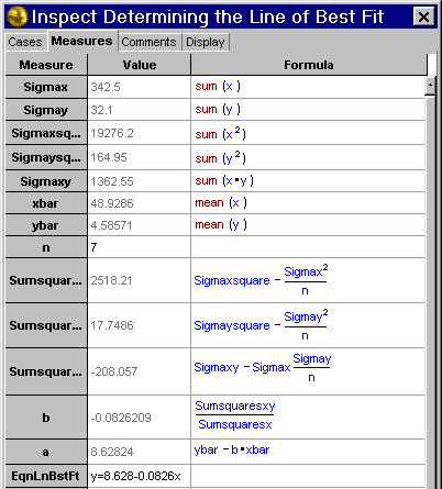
Therefore the equation of the line of best fit is:
% of drivers involved in collisions = 8.628 - 0.0826
x.
Analysis
To see how well the line fits, a correlation coefficient, r, needs
to be calculated. The correlation coefficient was calculated with
Fathom.
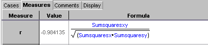
The closer |r| is to 1, the stronger the correlation
and since -1<r<1 and the correlation coefficient for the line
of best fit is -0.984 there exists a strong negative correlation.
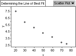
Therefore, y = 8.628 - 0.0826 x fits the data very well. The following
is a graph showing the original scatter plot including the Line of
Best Fit.
Although not required for the course, I wanted to try a similar procedure
with the Kanetix data as I did with the MTO data. I played with an
equation to find a curve with the best fit. However, due to the nature
of the curve, at some exponents the curve would not be calculated
to the left of the vertex. For observational purposes the centre was
set to be the last age group and the data was entered so to create
a reflection along the vertical line marked by the last actual age
group. The formula for the curve is shown below each diagram.
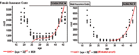
The Kanetix data plots show that a non-linear relationship
exists between insurance costs and age regardless of gender. From
this limited data, insurance rates drop as age increases regardless
of gender.
Conclusion
There exists a linear relationship between the percentage of drivers
involved in an accident and age. The equation of the line of best
fit is percentage = 8.628 - 0.0826 age. The correlation coefficient
is -0.984. In the Kanetix data, I can see a non-linear regression
in the insurance rates as opposed to the linear regression in the
collisions.
Section
2c - Probability distributions
Problem
I want to explore, with Fathom, the probabilities and their respective
distributions from the data attained from the MTO. I want to look
at the probability distributions of male and female drivers, the collisions
of male and female drivers, and drivers killed in collisions, all
with respect to their ages. I would like to see whether I can find
any differences in these.
Plan
Using Fathom, I will create a collection chart entering the data from
Table 2.2 and 2.20 from the MTO data. I will use Fathom to calculate
relative frequencies for male and female drivers as well as the relative
frequency of drivers killed. The relative frequencies for male and
female drivers will take the total population into consideration.
I will then create graphs to look at the probabilities (we will use
relative frequency as the best estimate to the probability) calculated
in the collection chart. That is, the chart is a collection of data
and the resulting probabilities.
Data
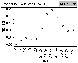
Graph 1: Relative Frequency of Drivers
Killed by Age Group
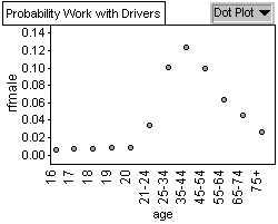
Graph 2: Relative Frequency of Female
Drivers by Age Group

Graph 3: Relative Frequency of Male
Drivers by Age Group
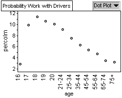
Graph 4: Percentage of Male Collisions
by Age Group
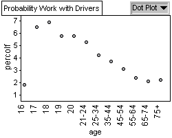
Graph 5: Percentage of Female Collisions
by Age Group
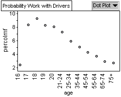
Graph 6: Percentage of Male and Female
Collisions by Age Group
Analysis
Graph 1 shows a bell shaped curve showing that 35-44 year olds are
killed more often in collisions. Graph 2 and Graph 3 show a bell shaped
curve demonstrating a similar pattern in driving age population for
both males and females, with most drivers on the road being between
35 and 44. Graph 4, 5, and 6 have a similar pattern concerning collisions
by age group percentage. The highest probability of being in an accident
whether you are male or female occurs when you are 18 years old.
Conclusion
Graph 2 and 3 shows us the probability of finding a 35-44 year old
driver is highest amongst all driver age groups for both male and
females. That is, male and female 35-44 year olds make up the most
drivers and thus we have a greater probability of finding them on
the road. Since they have the highest population on the road, they
also have the greatest probability of being killed while driving.
This is illustrated in graph 1. Looking at Graphs 4 we see that 18
year old males have the highest probability of males of being in a
collision. That is, the probability of being in a collision if you
are an 18 year old male is 11.4%. From Graph 5, we see that 18 year
old females have the highest probability of females of being in a
collision. That is, the probability of being in a collision if you
are an 18 year old female is 6.9 percent. Looking at Graph 6 we see
that 18 year olds have the highest percentage concerning their population
involved in a collision. That is, the probability of being in a collision
if you are 18 years old is 9.3%. Almost 1 out of 10 18 year olds is
involved in a collision. This is important to note concerning the
insurance prices for 18 year olds.
Section
2d - Project on simulation
Exploration
In this case I will be using simulation to explore a situation rather
than trying to answer a particular question. I will be simulating
the gender of the driver in an OPP random check of 100 vehicles (not
including large truck etc. which require special driver's license)
on the 401 for a given day of the year. I aim to explore how the composition
of these samples can vary when the procedure is repeated. I will look
at the proportion of male drivers in each sample and the mean and
standard deviation of the data accumulated when the experiment is
repeated.
Plan
As an estimate of the probability of the driver of the car being male
or female I used the data provided by the Ontario Ministry of Transport
in its 2000 Ontario Road Safety Annual Report, Table 2.16 which provides
Sex of Driver Population by Age Groups 2000. As part of the simulation
I will assume that only Ontario drivers will be stopped.
Analysis
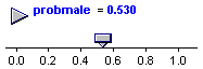
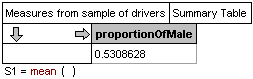
From Table 2.16 of the report 2000 Ontario Road Safety Annual Report
I find that there are 4,313,694 male drivers out of a total of 8,121,374
licensed Ontario drivers. Thus the probability that a random licensed
Ontario driver is male is 0.531 (to three decimal places). Since this
is a two outcome experiment and if I assume that drivers are statistically
independent the experiment suggests a Binomial Probability model.
So, with a sample of 100 vehicles, the mean number of males driving
the cars is given by µ = np or µ
= 53.1 males, with a standard deviation of

However this does not provide me with an indication
of what could be the result in each sample. To get this view I tried
a simulation and to do this I followed the Instructions given in a
Fathom Workshop Guide (reference)
The results of the simulation follow:
I introduced a slider for the probability of
stopping a male driver and set it to as close to 0.531 as I could
Through the simulation I generated a table of the
sample data
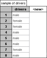
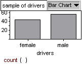
from which I generated a Bar Chart of
the gender distribution for 100 drivers. A typical distribution was
I then repeated the simulation 200 times,
in each case, noting the mean proportion of male drivers in each sample.
These 200 data were then plotted in a bar chart
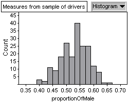
and the mean and standard deviation
of this distribution was calculated
Observations
Through the simulation I saw that the sample composition of male and
female drivers could change quite a bit from sample to sample, not
only in terms of totals but also in the order in which they appeared.
When this process was repeated a large number of times, the mean proportion
of all the samples was close to the one on which I based my simulation,
and although this number changed slightly as the number of repetitions
was increased, it stayed consistently close to 0.531, which I noticed
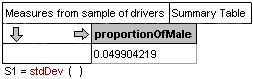
it is µ/n (where µ is the mean of the Binomial distribution).
The behaviour of the standard deviation was a bit more erratic than
that of the mean but it did move around the value of 0.05. I explored
to see whether this was related to any of the values that I used in
the simulation. I found that it is close to the sqrt(.431x.469) and
is therefore also close to ó/sqrt(n) (where ó is the
standard deviation of the Binomial distribution).
Section
2e - Project on the Normal Distribution
Exploration
The Fathom Workshop Guide that I used in my exploration of simulation
suggests that the distribution of the mean proportion of males in
my samples follows a Normal distribution.
Plan and Data
What I plan to do is to use the data generated from the simulation
and to analyse the distribution through the tools supplied by Fathom.
Analysis
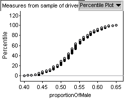
If the simulation data follows
a Normal distribution I would expect the cumulative distribution
to look like an S shaped curve very similar to the one I obtained.
I can get better visual confirmation that the data follows a Normal
distribution by looking at the Normal Quartile Plot provided by
Fathom.
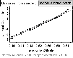
From the Fathom Help file - A Normal
Quartile Plot shows the distribution continuous (numeric) data.
It plots the z-scores associated with the percentile of each case
if the data were normally distributed. Therefore, if the data are
Normal, the plot should show a straight line. My simulation data
is very close to the straight line shown on the plot.
Finally, I can do some checking whether the
distribution of my simulation data
has the following properties of the Normal Probability distribution:
50% of the data falls on each side of the
mean
About 68% of the data falls within one standard
deviation of the mean
About 95% of the data falls within two standard
deviations of the mean
About 99% of the data falls within three
standard deviations of the mean
For my simulation data the mean proportion is 0.531, the standard
deviation is 0.0497 and the Dot Plot is
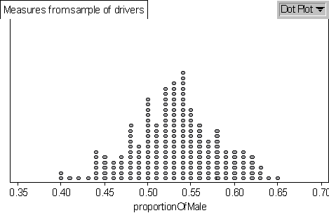
where each dot represents two data.
I counted the data in each interval and divided by 200 hundred to
get the percentage within each interval. I found the percentage
of data that falls on either side of the mean is 49.5% and 50.5%,
which is about 50% on each side of the mean. The percentage of data
that falls within one standard deviation (0.48 - 0.58) of the mean
is 73.5, which is larger than the predicted 68%. The percentage
of the data that falls within two standard deviations (0.43 - 0.63)
of the mean is 97%, which is larger than 95%. The percentage of
the data that falls within three standard deviations (0.38 - 0.68)
of the mean is 100%.
I did not have time to explore whether the approximations
that I did (rounding off the mean and standard deviation, and counting
from the Dot Plot rather than using the raw data) biased these results.
Conclusion
The work that I did suggests that the distribution
of the data I obtained from the simulation could be modelled by
the Normal probability distribution.
Project
Conclusions
So why am I paying so much for car insurance and
what have I learned? While searching for an area of interest and
locating data I discovered that limitations and validity of data
can seriously weaken or strengthen our project and our focus and
direction can change at any time. I also discovered that format
may also change and restructuring to strengthen the project may
be needed. A lot of research and work went into this project that
didn't make the final culminating project. This would seem to reflect
a lot of statements concerning the importance of behind-the-scenes
work. Since our exploration accident rates and age showed that there
is a linear reduction in our chances of being in a collision as
we get older, understanding why we, being young drivers, pay more
for insurance is fairly simple: we have a greater chance of being
in an accident. Although insurance rates are extremely high for
young adults they do decrease in a non-linear regression and is
much more reasonable by our mid-twenties.
With our exploration into probability we can say
that there are a greater amount of licensed 35-44 year olds and
thus we have a greater probability of finding them on the road.
Since they are the largest population of licensed drivers they are
killed more often in collisions and are in the most collisions.
However, 18 year olds have the highest percentage concerning their
age population of being in an accident.
While investigating simulation we saw that sample
composition of male and female drivers could change quite a bit
from sample to sample, not only in terms of totals but also in the
order of which they appeared. We compared our simulation data to
a normal distribution by comparing their properties. Namely, 50%
of the data lies on each side of the mean and comparing the amount
of data within 1,2, and 3 standard deviations from the mean.
I have learned a lot while doing this project,
not only about car insurance and accident rates, but also in the
amount of work and organization required to do research. It is disappointing
however to report that insurance rates are so high for young adults
because of something they can't change, their age. So consider high
insurance rates as a cost associated with a youth so many would
like to have back.
|